Go ask Elliott
First things first
- I miss the 'home' page with the cutout, and the calm space that it sets. Are you definitively opposed? My feeling is that this is still a nice landing page/ intro and that the site will not be accessed frequently enough for it to be a nuisance.
- option a) qdpg.ca acts as cutout landing page > cutout redirects to passivehouse.energy
- advantage that one can easily bypass qdpg.ca
- potential that qdpg.ca could have other cutouts in future (but do we need them?)
- option b) qdpg.ca is redirected to passivehouse.energy which has cutout landing page
- option c) something else?
- level of importance: high
- option a) qdpg.ca acts as cutout landing page > cutout redirects to passivehouse.energy
Formatting
- List formatting
- Are square bullets in these lists possible?
- interestingly, they are here for third order
- and fourth!
- level of importance: very low
- and fourth!
- interestingly, they are here for third order
- List pages cannot be set in justified text. Remove button?
- level of importance: very low
- Table formatting
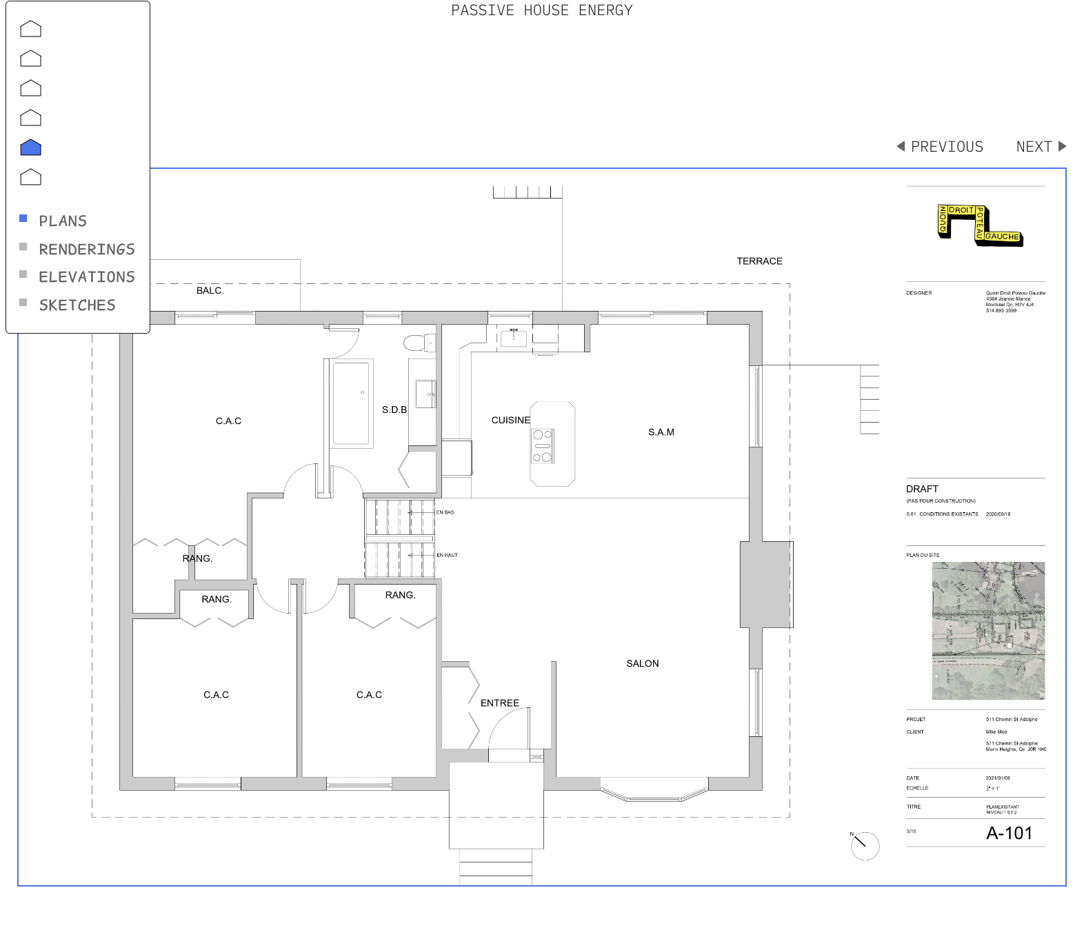
- Chrome based browser rendering issue (Brave, Arc). What's up with the heavy line after the second item in tables? This only happens when width of the window put that the date in the top corner (see image below) kirby weirdness?
- see below for example; pattern seems to be 2, 5, 6, 5, 5, 6, 5, 5, 6, 5, 5....
- possible to standardize to every 5?
- this problem does not exist on mobile
- problem does not exist in safari - chrome based?
- problem only happens when window is greater than certain width that places date in top corner
- level of importance medium low
Tables are perfect |
||
except for the strange |
||
heavy line between rows |
||
two and three |
||
they also do |
||
not need to be |
||
so wide, if that is |
||
possible |
||
well now i |
||
don't mind it |
||
now that i can see |
||
the pattern |
||
what |
||
is |
||
the |
||
pattern |
||
2 |
||
5 |
||
6 |
||
5 |
||
i'm lost |
||
will this one |
||
be |
||
five six or |
||
something completely |
||
different |
||
so they seem to be |
||
every |
||
five |
||
except for |
||
the six and the two |
||
which are the outliers |
||
i like the idea of the heavy line every fifth |
||
is it possible to correct that? |
||
every time i think |
||
i've found a pattern |
||
i have not |
||
1 |
||
2 |
||
3 |
||
4 |
||
5 |
||
6 |
||
7 |
||
8 |
||
9 |
||
10 |
||
11 |
||
12 |
||
13 |
||
- Tables are pretty wide; any way to alter this?
- possibly dynamic with a minimum?
- level of importance very low
- possibly dynamic with a minimum?
- Photo Album formatting
- Can the single image and the text and previous next button all be a bit lower. There is a minor conflict between the navigation and the text in the upper left corner.
- level of importance med low
Navigation
- Mobile and Desktop
- Something I'm not sure about: when you first click on a page the house remains 'illuminated.' However when you click anywhere on that page, the house light turns off. Should it stay on as a reminder of where you are?
- importance: very low
- Mobile
- Once you select an article/page shouldn't it look like this for more screen real estate, and similarity to desktop navigation?
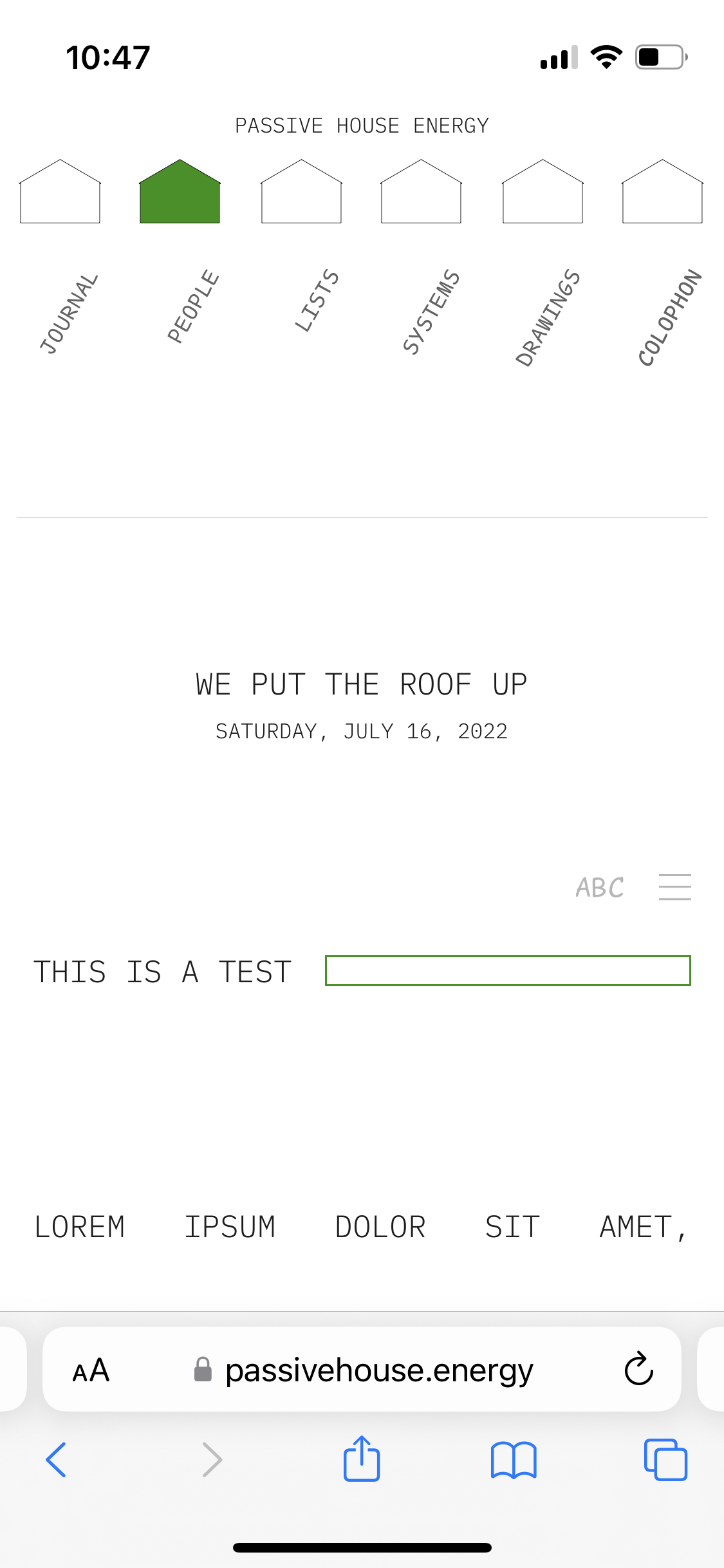
- Instead of like this, as it currently does
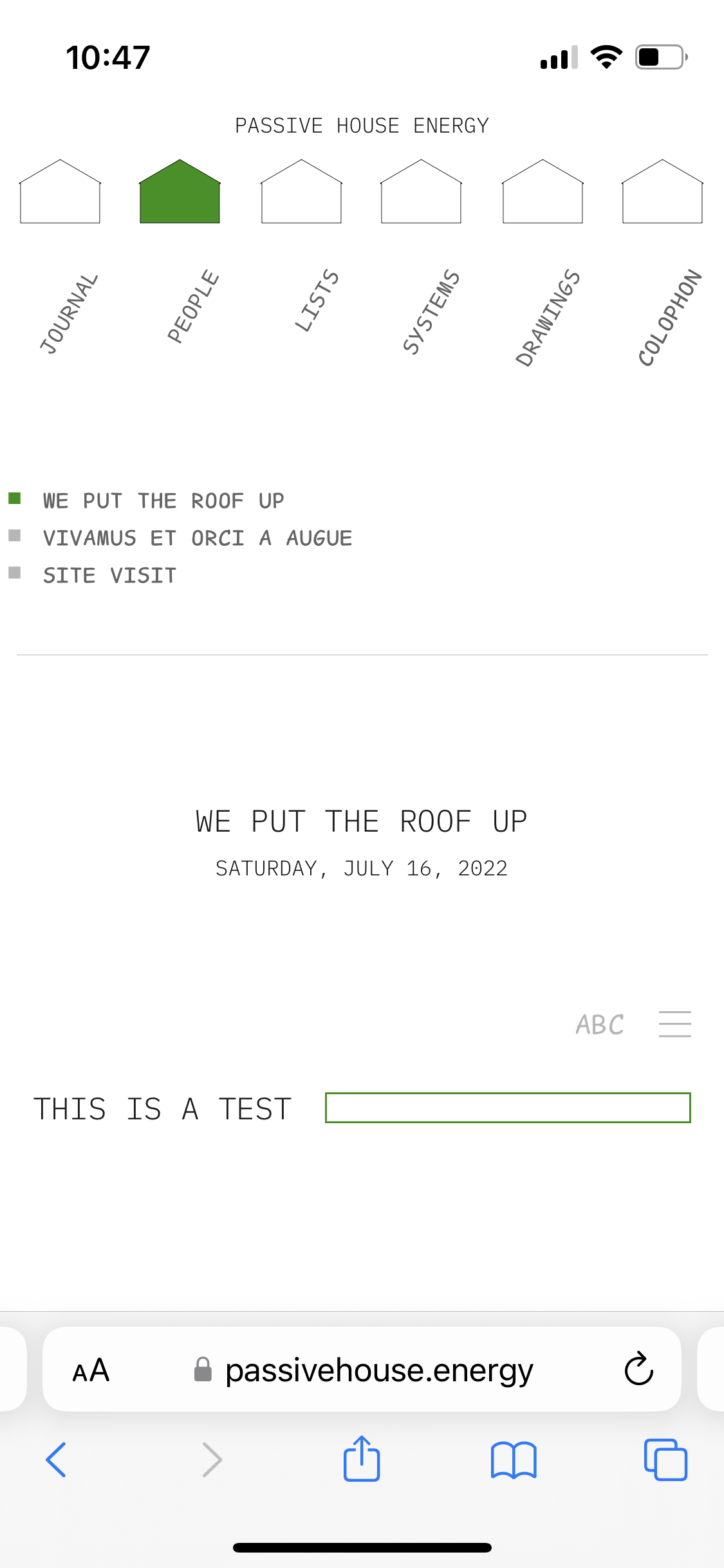
- level of importance medium high
- Desktop
- On the photo album when going through individual images the houses default position includes the drop down article names, but should probably be just the houses for consistency with other pages:
Other
- Other glitches
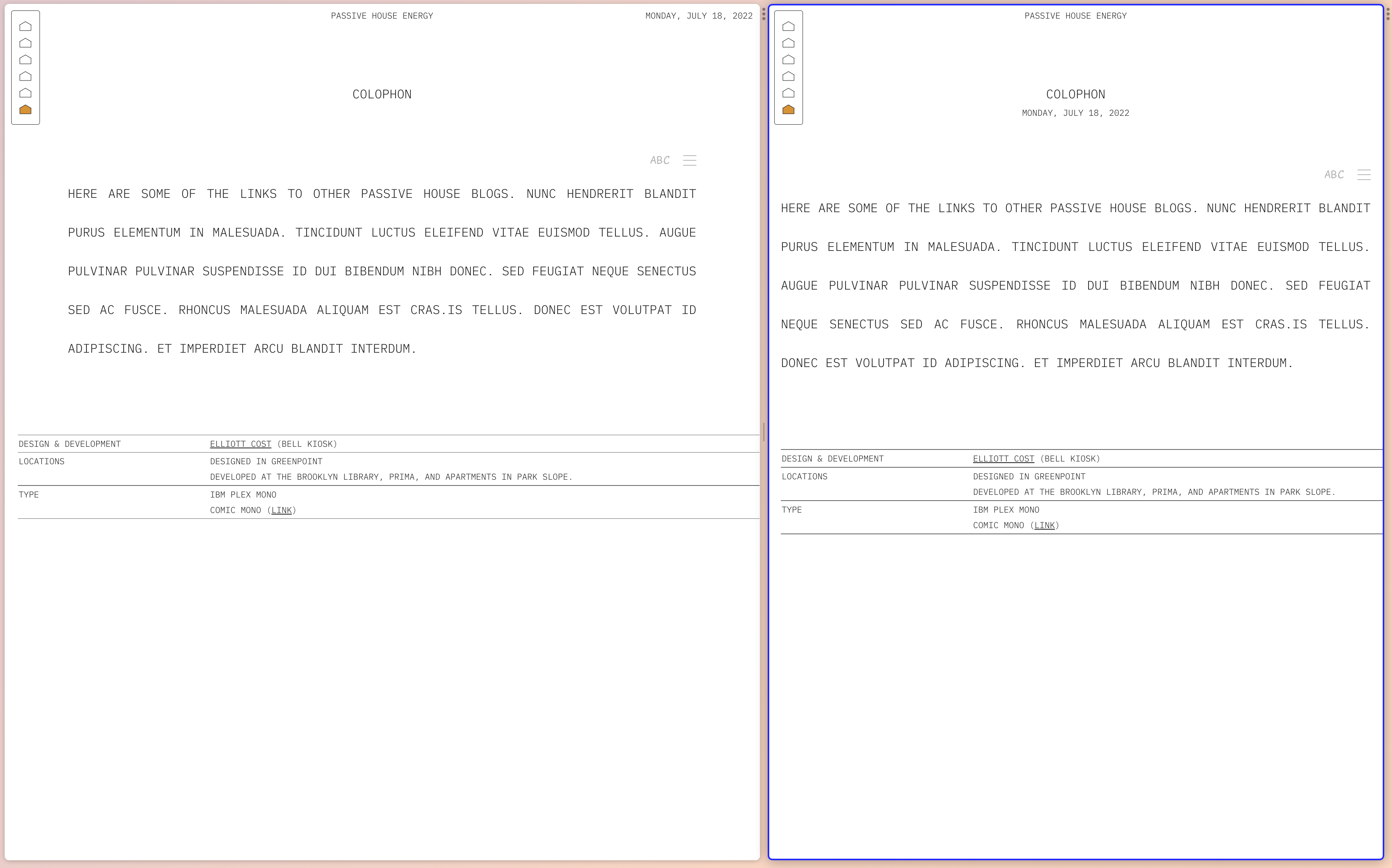
- Glitch on colophon page with ABC and justification--they skip back to default.
- level of importance: low